Thursday 20 December 2012

Found by Art Finder


During the Multiplied Contemporary Print Fair at Christie's this year, CFPR Editions was approached by the online gallery Art Finder - to discuss the possibility of entering into a partnership. CFPR Editions is extremely pleased to now announce its affiliation with the company and looks forward promoting its print publications amongst Art finders extensive list of artists.

In the companies own words,

Artfinder helps you find affordable, authentic art for your home, with each piece signed personally by the artist. We have a range of signed and numbered limited edition prints from emerging artist and acclaimed galleries. All have been hand-picked by our team, and are likely to become investment pieces over time. Because our customers asked for it, we're now introducing paintings and also offer a free bespoke 'art search' for customers who can't find what they're looking for on our site.

Artfinder chooses partners who offer accessible and exciting works to sell - and we like to be able to get our customers under the skin of how and why works are produced. With artists like Carolyn Blunt and Roy Voss, and its programme of innovative printing, CFPR offers not only great works to buy, but also a host of interesting stories to tell.

Tuesday 18 December 2012

CFPR Editions now prints video!


Andrew Super, World Trade Center Attack (2012)

CFPR Editions is currently undergoing a collaborative print production with the artist Andrew Super, who's work explores mediated avenues of viewership. From a philosophical stand point the artist explains that his work is grounded in an exploration of time, specifically how little bits of time come to be understood as personal, cultural, or historical moments. His photographic and print based works take extended periods of time, well beyond what could be understood singularly as moments, and compress them into singular images through the mediating forces of either the camera or Photoshop. The resulting images question the very momentous nature of the subjects, allowing viewers the opportunity to explore an event in a significantly different fashion.

Andrew Super is an American artist, currently living and working in the UK. He holds degrees in studio art and photography, and is pursuing a PhD at the University of Wales, Newport. For further examples of Andrew's work you can visit his website www.andrewsuper.com

Andrew talks further about the ideas behind this work below:

This work is conceptually grounded in, of all things, a lecture repeatedly given by Henry David Thoreau starting in 1851 entitled Walking. The lecture, a proto-romantic dialectic about man’s relationship with nature at the end of the industrial revolution, seems contemporarily prescient. Thoreau spoke of man’s general inability to engage with the world around him in a personal way, constantly observing nature but hardly ever engaging with it. Likewise, as we further relegate our experience with the world to digital realms, I am troubled by a similar sense of disengagement. In the same manner that romantic artists searched for a way to visually cope with the ever-increasing rationalisation of the world, I am similarly exploring the digital landscape of video-centric territories of the internet, like YouTube and LiveLeak, searching for a mediated sublime. The video sources for these images directly evoke the sublime, with their subjects inherently being recordings of personal, social, or cultural violence. When viewed via an embedded media player on a website, the graphic nature of the videos is particularly present – they are almost all amateur recordings with cheap equipment, shot in the midst of action as opposed to the distanced and dispassionate observation of documentary.


Once uploaded to the web the video recordings become incredibly democratised and, ultimately, legitimised by the nature of where they are presented. As videos rack up views, likes and dislikes, and multiple pages of comment threads, they gain social importance in a manner that was once doled out by journalists and historians. While the tangential data affixes itself to the videos and alters their historical presence, the original content becomes altered, skewed, and muddied. This work captures the content of these videos removed from the context of their analytics, second by second, and focuses it through an entirely different set of lenses. The videos become relegated back to pure imagery, historically similar to traditional film being comprised of a multitude of static images. These individual images are layered together and mathematically averaged to create a single image, technically encapsulating the entire content of the source. While the entire content of the video is present in the image, the amalgamating process by which it is constructed removes entirely the graphic (in both the denotative sense of the image producing a clear picture and the connotative sense of the image illustrating violent action) and historic origins of the source. 

What is left is a cloudy, abstract field of softened colours, devoid of representation. The process of observation has been mediated from direct point of contact to videographic documentation, to internet compression, to digital remediation via Photoshop, to direct point of contact with a static, printed image. What began as terrifying documentation of event has been translated into tranquilising illustration of idea.


Andrew Super, Death of Gaddafi (2012)


This work relies heavily upon various methods of mediation and remediation to produce final products. Photography and video are intrinsically linked, but often difficult to reconcile as the photograph is viewed as not presenting enough (i.e. it only illustrates that one point in time) while the video is viewed as presenting too much (i.e. it generally prohibits certain moments from having more visual power than others). For all of their artistic merits, these mediums are intrinsically tied to an idea of reality, as they are, by their nature, methods of recording. This work removes itself from a sense of observation or record by translating video into photographic image, and then further translating photographic image into the purely abstract.

A cogent and graphic example illustrative of the power of photographs depicting moments in such a way is in Nick Ut’s 1972 Pulitzer Prize winning image of Phan Thi Kim Phúc running out of the mist of a napalm bombing, which can be viewed and read about here.

Once the images no longer refer to a reality (or to a thing) they are free to be purely about idea in a way that the video and the photograph struggle to be. Once the images are printed, they exist within a cultural conversation about art and its historical contexts, free of the socio-cultural contexts of the source videos. The images become things in their own right as prints, and allow viewers to cope with them as objects in a way that is significantly more difficult with video and photographic works. 


Andrew Super, Napalm Girl (2012)


Even though the subject matter of the images is not pictorially referenced on paper, the digital origins of the sources maintain a dictating force in the physical manifestation of the prints. As the photographic image capture takes place on screen, with a low resolution, the prints mirror their foundation, being output at the exact dimensions and resolution of the capture.


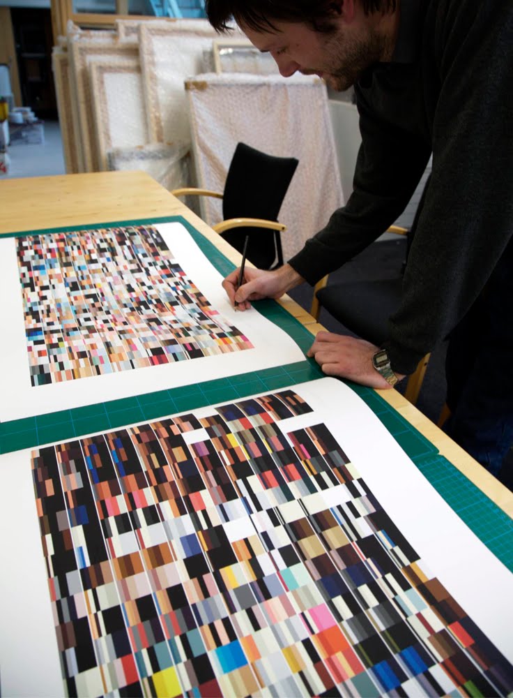
Artist Andrew Super print proofing at the Centre for Fine Print Research 2012

Currently the work is undergoing output tests to determine the method most appropriate to make physical the imagined (meaning that the images, until printed, are intangible manifestations of an idea).


Thursday 13 December 2012

Live with Rise Art


CFPR Editions is pleased to announce that it has entered into a partnership with the online gallery Rise Art - a resource enabling anyone to access great art for their home or office walls. 

"We are really happy to have CFPR editions on Rise Art for sales and rental" said Scott Phillips, founder of Rise Art. "CFPR works with some very talented artists to produce stunning editions that are quite accessibly priced. We're looking forward to sharing these works across our online community". 

The company works with top new artists as well as galleries and museums such as Tate, Serpentine Gallery and Julian Page Fine Art to help their members discover wonderful work on any budget. Rise Art will often commission artists to produce new works for the site, uniquely for their members. Their rental offering allows people to enjoy art in their home before they buy, with the option to return or rotate new art at any time. Credits from the rentals can be applied to purchase. You can browse the art for sale here.

CFPR Editions collection is now available to view on Rise Art here

Friday 26 October 2012

In Print


CFPR Editions is now 'in print' or more specifically p 56 in this years Editions and Multiples supplement that is part of Art Reviews Nov 2012 Power 100 issue. Other editioning galleries and studio's in the supplement include the ICA, Manifold Editions, Baltic, Whitechapel, Eyestorm and Other Criteria to name but a few.

Thursday 18 October 2012

Creating Craters

'27.3 to 29.5', 2012 by Hen Coleman, Laser engraved black somerset paper 400gsm, (97cm x 97cm) Edition of 10


CFPR Editions is pleased to announce its recent collaboration with London based artist Hen Coleman whose work combines photographic, drawn and printed elements.
In this new work an image of the moon´s surface has been burnt into a heavyweight black paper, recreating a literal topography of the lunar surface. Here the light of the laser elicits the image in the same way that the sun illuminates Earth´s moon.

Collaborative print team contributors include: Tom Sowden, Hen Coleman and Paul Laidler

Sunday 7 October 2012

Murray on Multiplied

Supporting Multiple Art, Interview with Murray Macaulay by Isabel Elorrieta, Grabado & Edicion, Print and Art Edition Magazine, 2012

The Print and Editions magazine g&e (Grabado & Edicion) has recently interviewed the director of the Multiplied Art Fair Murray Macaulay. The interview entitled Supporting Multiple Art is available to read as as an e-publication on their g&e website. As part of the the interview Murray Macaulay discusses the premise behind initiating the editions fair at Christie's, the perceptions of the graphic art market in the UK and what to expect from the London based event from 12th - 15th October 2012 now in its third year.

Tuesday 25 September 2012

CFPR Editions in Münsterland

Snap 2012, 2nd International Printmaking Symposium, Rheine, Germany 27th - 30th September 2012

Paul Laidler (Academic Lead for CFPR Editions) has been invited to present a lecture about the development and ethos of the university based publishing practice at Snap 2012 - part of the 2nd International Printmaking Symposium in Rheine, Germany. The event includes major publishers, galleries, museums and dealers, which will illuminate the subject of printmaking from the economic side whilst raising questions about educational strategies with regards to printmaking in contemporary times.

As part of the opening day lectures Paul will be presenting alongside Dr Carinna Parraman and Sarah Barnes from the University of the West of England, Bristol. On the following day Paul will then contribute to a panel of speakers on the topic of Contemporary Prints in the  Museum World and the Art Market. The panel includes; Diana Ewer (Co-founder of TAG Fine Arts), Daniel F. Hermann (Curator and Head of Curatorial Studies at the Whitechapel Gallery, London), Matthias Kunz (Sabine Kunst Gallery), Susan Tallman (Chief editor of Art in Print online magazine) and Prof Liz Ingram (Professor of Printmaking at the University of Alberta, Canada).

Tuesday 18 September 2012

Two heads are better than one.

Brownister Hen, Waste 2, 2012 (cast resin skull series)
The second cast resin skull by the artist Brownster Hen in the 'Waste series' is now complete. Preparations for the next installment is under way. See Waste 1 here

Thursday 16 August 2012

A fair assessment


When visiting the Editions/Artists' Books Fair in New York last November there was a lot of talk about an emerging UK version of the US based event. At the same time and in contrast to the established uptown Armory show the E/AB fair (located in Chelsea) appeared to be encouraging broader interpretations of the multiple and editioned artefact whilst potentially nurturing the up and coming print enthusiast. With these sentiments in mind CFPR Editions are excited to be gearing up for this years London editions fair at Christie's

Highlights from last years Multiplied Contemporary Editions Fair

Christie's Murray Macaulay, Director of Multiplied, talks about the pioneering art fair dedicated to contemporary editions, held during London's Frieze Week. This video takes you inside the fair and features works by Henningham Family Press, Ackroyd & Harvey, Bob and Roberta Smith, John Frankland, Printed Wonders, Michael Craig-Martin, Jack Featherstone, Juan Fontanive, photographer Chris Floyd and others.

Friday 27 July 2012

The seed of an idea


We have spent the past few days considering the incremental digital 'decimation' of a scanned tulip bulb for the artist Gordon Cheung. In no more than five devolutionary stages the bulb moves from a high resolution 3D recording (constructed of 381,774 triangles) to a simplified and singular pyramid structure. The specific tulip bulb that was recorded for the series is a Rothchild bulb that was selected by the artist whilst visiting Amsterdam earlier this year. The artist explains that the bulb is named after one of the most powerful banking family dynasties in history and therefore a principle player in spreading Capitalism globally. More to follow in the coming weeks.....

Monday 23 July 2012

A room with a review


The following review of the Just Press Print exhibition at the Northern Print Gallery is by Sara Ogilvie, an artist, illustrator and Senior Lecturer in Imagemaking within Graphic Design, Northumbria University in Newcastle, UK. 

Most often an exhibition consists of marveling at polished final outcomes. Just Press Print, curated by Dr Paul Laidler from The Centre for Fine Print Research (CFPR) at University of the West of England, is an invitation to explore beyond this and get under the skin of the print process in its many forms.

CFPR is renowned for its cutting edge print facilities so it is no surprise to see an eclectic range of published prints on display. These recent prints have evolved from CFPR collaborations with a carefully selected group of artists. From mind bending vectors of flaming ice creams to 3D polymer Lichtenstein-esque knuckledusters each project vies for your attention to uncover how it came to be.


Layers of paper sketches, notes and test proofs bundled in bulldog clips hang informally from the walls. Rifle through these pages and you can share in the artist and printer exchange; eavesdrop on dialogue, decision-making and the ups and downs of the creative process that unfurls. It is this factor that pulls the diversity of artists together in this show and hooks the viewer into the work.


Designer Sebastian Schramm’s brief email asking, ‘Don’t you want to sell my prints?’ is a forthright invite which lead to a long distance collaboration between Schramm in Germany and Paul Laidler in the UK. The exchange is at times rapid fire, bouncing feedback on scale and colour, correcting digital photographic images of porcelain figurines augmented with unexpected head balloons in an exploration or alienation and individual behavior. The final edition of large saturated inkjets is vivid, striking and unsettling in equal measure.


Like Schramm each exhibiting artist opens the doors to their process and it is this welcoming, inclusive quality that is so refreshing. In Paul Coldwell’s accompanying visual chronicle we see more of the artist in the throws of the project. Scrawled sketchbook pages, noting the music playing in the studio and a packet of Trebor mints stray into shot. With a jaunty thumbs up over the printing press the atmosphere suggests a more easy going tempo in comparison to Schramm’s.


Coldwell’s outcome, ‘Lines and Branches’, shows two relief prints taken from laser cut MDF, which are also on display, depicting treetops coarsely treated with exaggerated halftone dots. Small personal artifacts are depicted such as letters, kirby grips and combs, items that keep strands together, separate or suggest lines of correspondence all related to family trees.


There are some fine examples of 3D printing on display. Katie Davies and Peter Walters have created ’Vela’ (2011) an elegant ghostlike form sitting quietly on its shelf. Inspired by remote constellations it is a transformation of audio data from a pulsar star into a 3D rapid prototype. In contrast to this is Brendan Reid’s Manta Ray, a 3D technicolour prototype with a rhythm of rainbow stripes shouting for attention.


Other intriguing colour concepts of note are Arthur Buxton’s obsessive digital data visualisations of British Vogue covers from 1981-2011. Like scrambled TV test cards predominant and common colours come to the fore in ordered bars. The results show that trend colour preferences have lightened in tone over the last 30 years.

This show undoubtedly displays the forward thinking ethos of CFPR in relation to digital technologies however it is encouraging to see everything in the mix; traditional, digital and 3D technologies are interwoven here.


It successfully spotlights how specialist guidance and liaison can help artists discover and ‘make’ in new ways, leading to unexpected print territories and possibilities. In his PhD curator, artist and CFPR printer Paul Laidler has explored whether the role of Master printer is still relevant in todays technological democratisation. This exhibition firmly suggests it is.

Friday 13 July 2012

Mark's musings


UWE MA Printmaking student Mark Curtis Hughes has recently been assisting CFPR Editions with the printing of Paul Coldwell's laser cut and relief print edition entitled Lines and Branches. As part of the invitation to contribute to the project Mark was encouraged to reflect upon the process in relation to his own printmaking practice. In the proceeding text Mark discusses the differing approaches and considerations when printing in relief.


In my own first blog posting I mused with some open-ended questions about the importance of planning and preparation in the printmaking process. Over the past two months I’ve been working on two very different projects, one of my own and one through CFPR at UWE.

With CFPR, I’ve been helping edition a woodcut series for the artist Paul Coldwell. The blocks were made of MDF and lazercut. At the moment I’m doing test strips for white ink on black paper- we’ve already printed an edition black on white. The prints have just one layer, although for future editions colour will be added. The print I’m doing for myself is called “there she goes my beautiful world.” It’s also a woodcut, but I’m printing it as a reduction. So there will only be one edition. My aim for the print was to approach it in a painterly way- by improvising each layer as I came to it.


With the Coldwell print, we naturally made no contribution to the image, and CFPR and my involvement was purely technical. ‘We needed a perfect edition. What’s the best way of accomplishing this?’ So our approach was through lots of tests, proofs and concise documentation. There are all sorts of variables when making a run- ink consistence, rolling consistency, registration, packing and mess management- to name a few. Printing on the Columbian press we have at UWE we spent a lot of time fiddling with our packing set up. I was surprised how much the pressure varies between a test strip and a full print.

Something else I had to become familiar with was the block. I’d never printed a lazercut block before so I was interested to see how it might print differently. MDF itself prints similarly to lino; you get a sharper cut and less texture than with a regular piece of wood. This, with the precision of the lazer mean that the image we were printing was very fine and flat and required a smooth even layer of ink over the whole surface. An early problem we had was that the block itself was too thin, so when I rolled on the ink the board bent resulting in a sharp rectangular faded area on the print.

The wood I’m using is from a reclamation centre in Bristol. It’s a kind of hard wood, rich in colour, fine grain and easy to cut. It’s also got dents, cracks and holes all over it, which I incorporated into my design. It also has an impact of the layer of ink. I feel things like that gives the print and the block more personality.

Unlike, the Coldwell print I’ve been hand burnishing my woodblock. I use an assortment of spoons for different pressures and surface areas. This means I don’t need to worry about packing, however I do put newsprint over the paper to keep the back clean while I’m working. I think that hand printing gives you a texture you can’t achieve on the press; it also gives you more flexibility. But it is more labour intensive, even compared to the Columbian.

One similarity between the projects is registration. For the Coldwell prints it’s simply a means of ensuring uniformity through the edition. For mine it’s necessary to make sure all the layers line up. I’m allowing myself to be fairly flexible in my edition, allowing the layers of colour to flow and interact in an open playful kind of way. I don’t mind if there is some variation, as long as it’s contained with the boarder.

It’s really important to have a safe registration method; because the less time you’re faffing with the paper- getting it in place- the less likely you are to get ink or dirt where it shouldn’t be. With the Coldwell series we developed an order for rolling, lifting, covering and so on, involving many pairs of disposable gloves all in order to make sure the environment stayed as clean as possible. I took some of the ideas into my own edition. Particularly thinking about how the Chinese printmakers have a very ergonomical set up where the inks and the papers, and the cutting and printing areas have defined stations. All within easy reach. I’ve found that having an organised base on both projects is a very effective way of anticipating a level of quality in an edition. For my own prints, it was a secure starting point, to allow me more creative freedom.

Friday 29 June 2012

Brown waste

Brownister Hen cast resin skull series
Artist Brownister Hen has been developing a cast resin skull series as part of an ongoing collaborative conversation with CFPR Editions. The skulls are created from the remnants of Brownister Hen's many resin based studio projects - by emptying any discarded casting mixtures into a skull mould the artist essentially recycles his waste. More to follow in the coming weeks.......

Saturday 23 June 2012

Just Press Print Opening

A selection of photographs from the Just Press Print Exhibition 

CFPR Editions would like to thank all who attended the Just Press Print private view on the 20th of June 2012 at the Northern Print Gallery in Newcastle. We would also like to thank all the artists involved  and a special thank you to the team at Northern Print for their assistance and support toward the realisation of the show. I would also like to thank CFPR Intern Verity Lewis and UWE MA Printmaking Student Mark Curtis Hughes for their respective contributions to the project.

Tuesday 5 June 2012

Exhibition Announcement

Just Press Print Exhibition, Northern Print, Newcastle-upon-Tyne, 21st June - 10th August 2012

The exhibition Just Press Print presents a series of digitally mediated artworks that have been initiated as part of a print editioning and publishing practice. The emphasis on digital technology within a discipline that is predicated in print seeks to explore the  broadening possibilities for the graphic artifact in the digital age. 
The exhibition features a number of early career and established artists as part of CFPR Editions exploration of contemporary print developments - whilst ensuring a diverse range of styles and approaches when realising ideas in print. Artists in the exhibition include:
 Carolyn Bunt, Arthur Buxton, Paul Coldwell, Richard Falle, Brendan Reid, Sebastian Schramm, Roy Voss, Katie Davies and Peter Walters

Within the context of a collaborative print studio practice, the exhibition format will also include the printed matter and conversations that both inform and reveal the physical renderings of the 'push button' process.

CFPR Editions is equally committed to the broader field of research and the dissemination of its collaborative undertakings as part of the Centre for Fine Print Research, UWE, Bristol. In response to the development of CFPR Editions Dr Paul Laidler will be presenting a paper  entitled Digital publications and technical innovations; the collaborative print studio in the digital age as part of the Industry and Genius in the Printing Trade Conference held by the Printing Historical Society, Birmingham City University, September 2012.

Friday 1 June 2012

Falle's Inferno

Richard Falle, Ice Cream Inferno, 2012 Pigmented Inkjet Print

Ice Cream Inferno, 2012 is the latest vector based work to be published at CFPR Editions for the artist Richard Falle.  The artist describes his series (including Exercise 10: Phalaenopsis Memento Mori, 2012 and Exercise 8: Tied, 2012) as 'being motivated by a masochistic passion for generating intricate digital drawings that work entirely within the confines of Adobe Illustrator. Here the subject matter of these images is full of cartoon like absurdity, with an undercurrent of disquiet or tragedy.' 


Wednesday 16 May 2012

The Italian Job


Artist Arthur Buxton is nearing the end of his collating, recording and sampling work for the fourth and final print edition in the Vogue Covers series. Having finished the printed versions of British, Paris and USA Vogue Buxton is currently compiling the colour data needed to generate the last International Vogue magazine to be ‘covered’ for the edition - Italian Vogue.

After recently speaking with Arthur Buxton about the duality of the printed colour series (as artworks and information charts) the artist discussed the structure and function of colour that underpins his interest in trends.

British Vogue Covers 1981 - 2011

US Vogue Covers 1981 -2011

Within each piece the small bar charts (measuring 2.4 by 2.9 mm at 1:10 scale to the originals) show the five most prominent colours, proportionally, in an individual Vogue cover. Each column is a year starting with September and working down to October at the bottom. The columns run from 1981 on the right working across to 2011 on the left. After viewing the work one becomes increasingly a where of the differences in overall national colour palettes.

Paris Vogue Covers 1981 -2011

The most striking trend is the recent preference for paler colours, which is evident on all three charts. Seasonal trends are more subtle. The Paris edition is mostly published only ten times a year which shows up as duplicated rows in August and January. Gaps occur where covers are unavailable.
Aside from seasonality and longer term changes in colour trends, other, more quantitative data is evidenced. By looking at ‘Paris Vogue Covers 1981 - 2011’ we can see a sudden change in tones which occurs in late 1987. Colombe Pringle became the magazine's editor-in-chief in December 1987. The colours undergo a sudden change again in 1994 when Joan Juliet Buck, an American, was named Pringle's successor.

Also see Design site Fast Company  and their 'Infographic of the day' review featuring Arthur Buxton's vogue series: Seeing Fashion History, by Reading 130 Years of Vogue into Color


Tuesday 15 May 2012

The Variant Voss

Roy Voss The Explorer, 2012

After many weeks of proofing the three colour UV print entitled Explorer by the artist Roy Voss the printed edition of seven is now finally complete. During this period the separately printed Cyan, Magenta and Yellow figure proved to be slightly more problematic than expected! In order to achieve a consistent edition of seven a further five prints of 'lesser consistency' were needed. Editioning conventions often dictate that the imperfect or technically unsound prints be disposed of or identified as such. The variant edition can be considered as a method for 'exploring' different inking options from a single image.

On a separate occasion and after discussing the 'blurred' area of the variant edition with the artist, it was decided that the five explores were to be reinstated, signed by the artist and entitled variant edition.

Collaborative print team contributors include: Roy Voss, Verity Lewis and Paul Laidler

Monday 7 May 2012

Next Station

Carolyn Bunt, Station to Station (you drive like a demon), 2012, Pigmented Inkjet Print

Artist Carolyn Bunt has recently completed her latest petrol station print edition in the ongoing series published by CFPR Editions.

Thursday 3 May 2012

Tulip Tests

Screen grabs from 3D Modeling program Rihno 

CFPR Editions has recently begun the testing phase for Gordon Cheung's 3D printed tulip series - with assistance from rapid prototyping specialist Dr Peter Walters. The initial development stages for the project will assess the physical rendering propertise of a pre-modeled file downloaded from the online stock catalogue Turbosquid

Friday 13 April 2012

HP Lime or Epson Apple?


CFPR Editions have recently begun working on a series of pigmented inkjet prints with German designer Sebastian Schramm. The series is still in the early collaborative proofing stages with dialogue exchanges on printed colour appearance and scale relationships.

Thursday 29 March 2012

Trends to be Continued.........

Arthur Buxton has recently completed a second print edition in his series of Vogue Covers at the CFPR. Paris Vogue Covers 1981 - 2011 continues Buxton's trend visualisation work using open source software to map the five most prominent colours from an archive of Vogue magazine covers. Buxton plans to continue the series by mapping Vogue USA and Italy for further Editions.

Sunday 25 March 2012

CFPR Editions: recent works exhibition


My name is Prints and I am funky, CFPR Editions: Works in Progress, Bower Ashton Campus, F-Block Gallery, UWE, Bristol 2012


Wednesday 21 March 2012

CFPR Editions Exhibition


My Name is Prints and I am Funky, CFPR Editions Proofs & Prints, F-Block Gallery, Bower Ashton Campus, UWE


Members of the Centre for Fine Print Research will be exhibiting new projects and artworks in the Bower Ashton F- Block Gallery, UWE between the 19th - 23rd March. As part of the exhibition CFPR Editions will be presenting some of the latest collaborative print projects. The exhibition format will be presented as works in progress showing the proofing process and source material used to develop the work.